


How to Draw Trend Lines


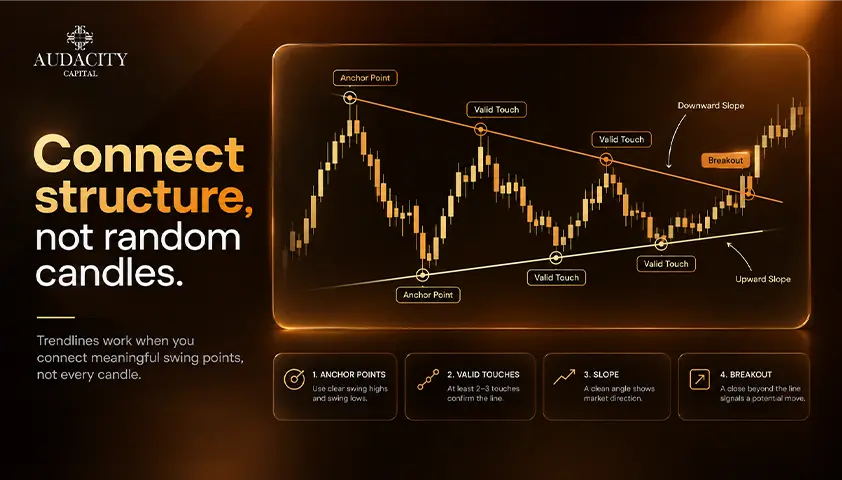
Two traders can see the same chart and see the same trend yet draw two totally different trend lines. One passes through the wicks; the other is through the bodies, and both believe they are right.
The problem is that a line that appears correct after the fact is not always helpful during the event, since they keep redrawing the line until it matches what has happened.
This guide will explain how to draw trend lines as a method, and how to make the finer judgment calls as to whether your trend lines will be helpful or decorative.
This article provides information for educational purposes only and is not intended to be investment advice. Trading is a high-risk activity.
What a Trend Line Is
A trend line is a straight line that connects two or more swing points on a price chart. This line reflects the direction of a certain trend and shows areas where price constantly finds support or resistance.
There are two kinds of trend lines: an uptrend line connects rising swing lows and is placed below the price, becoming dynamic support, while a downtrend line connects declining swing highs and is placed above the price, becoming dynamic resistance.
A characteristic feature of trend lines which does not apply to horizontal levels and is quite crucial is connected with the idea of dynamic support and resistance. The price of the line constantly changes every time a new candle appears.
How to Draw Trend Lines, Step by Step
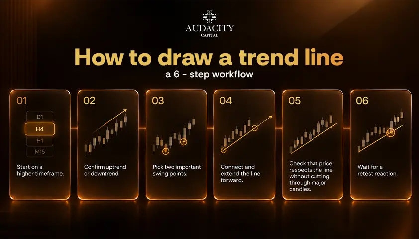
There are 6 steps that are explained, and two traders using the method should come to broadly similar lines.
Step 1: Start from a higher timeframe.
You should begin your analysis on a daily or four-hour chart before moving to a lower one.
There are fewer and more important swing points on a higher timeframe, so the line is not just noise but the real market structure.
The downside is that there will be fewer lines and signals as well.
Step 2: Confirm the presence of a trend.
For an uptrend, search for a series of higher highs and higher lows, and for a downtrend, look for lower highs and lower lows.
If there is no direction in the price movement, then the diagonal trend line is not the right instrument; instead, a horizontal range describes the market better.
Step 3: select two important swing points.
If it's an uptrend, use two swing lows. If the trend is a downtrend, then use two swing highs. Important refers to major price reversals, not all minor price wobbles.
This is where a majority of the subjective judgment comes in, which is why these subsequent sections exist.
Step 4: connect them and extend the line.
Join the two points and then extend it to the right, past current price action. This is because the strength of a trend line is in its projection, not in its history.
The drawback here is that projection is just a hypothesis until price proves it.
Step 5: verify that price honors the line.
A good trend line must not intersect large parts of price action between the two points. If it cuts through, then the touch points you've selected were likely the wrong ones.
Step 6: wait for a test.
A line is nothing unless the price comes back and reacts to it, because it is possible to draw a line between any two points. Think of an untested line as being a hypothesis and not a level.
Uptrend line | Downtrend line | |
What you connect | Rising swing lows | Falling swing highs |
Where it sits | Beneath price | Above price |
What it acts as | Dynamic support | Dynamic resistance |
What a break suggests | Buyers losing control | Sellers losing control |
What a break does not mean | That a downtrend has started | That an uptrend has started |
Wicks or Bodies?
This is the question most frequently asked when drawing a trend line on a chart, and many guides pose this question without answering it. Here are both sides and a clear recommendation.
For wicks:
The information conveyed by candle wicks and bodies is distinct. Wicks indicate the highest and lowest prices reached within the candle. The trend line drawn on them will be truly extreme.
Disadvantage: A mere spike due to thin liquidity can take the entire trend line out of position.
For bodies:
Bodies are indicative of the opening and closing level of the price, which some traders consider more reliable in terms of determining the actual level.
The weakness is that the line ignores actual trade prices at the edges.
The resolution is much easier than the controversy. Either approach may be considered valid, but what is most important is being consistent with whichever approach you choose.
A trader who switches between wicks and bodies depending on which produces the neater line is fitting the line to the chart rather than to a rule. Pick one, write it down, and use it every time.
The Problem With the Three-Touch Rule
Most articles about trading with trend lines have a rule that says that two touches create a line and three confirms it. This is a sensible rule that is worth considering. Any two points can be connected, so three touches offer some extra validity.
The issue no one talks about is timing. It's only after the third touch that the line has three touches, which means that the confirmation is always after the fact.
Those lines that fail on their third test are never discussed in tutorials as nobody wants to publish a failing line. The rule seems stronger when applied to a hypothetical chart than on a live one.
Repeated testing will affect the perception and behavior of traders to a certain level. Although a line that is tested many times will seem solid, it doesn't mean that repeated testing will mean that the next test holds.
Retesting isn't only a sign of strength. View touches as confirmation that the line is valid, but not a guarantee of future performance. The three-touch rule is just a practitioner's rule, and not a law.
Linear or Logarithmic Scale?
It is not listed in most of the guides but influences both the position of the trend line and the point where it breaks.
The principle is simple. The linear scale provides equal price distances for identical absolute amounts. The logarithmic scale gives equal price distances for identical percentages.
Draw the trend line on a long advance, and you will notice the lines diverging, and the break will occur at a different price and time.
It is important to mention that it depends on the percentage range shown on the graph.
In case of an intraday chart of a currency pair, when the overall movement is small in percentage, the difference is negligible.
In case of a daily or weekly chart of an index, a metal, or a cryptoasset that has moved a large percentage in months or even years, it may make a significant difference.
The larger the percentage range visible, the more the scale choice matters.
Make sure what scale your chart uses before you start drawing. On MT5, right-click on the chart and go to its properties, there you will find scale settings for the price axis.
On DXTrade, you can find the toggle for setting scale in the chart settings menu close to the axis settings. Use logarithmic scale for long-horizon charts with large percentage moves, and linear scale is usually fine for short-term, small-range charts.
Why the Angle of the Line Matters
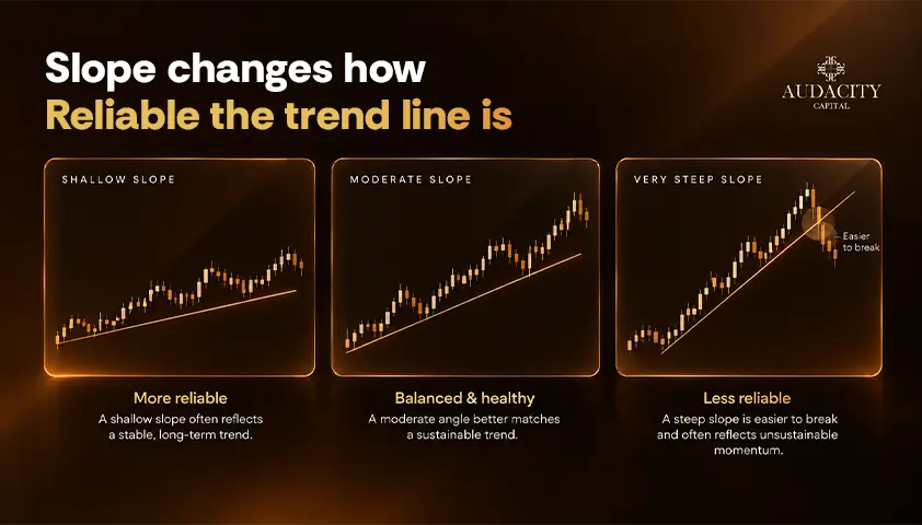
Some guides list a very steep trend line as an error without specifying why. There is information in the angle and slope of the trend line.
Very steep trend lines could be unsustainable because they indicate fast price action. And if one breaks, the price will continue moving in the same general direction but along a less steep trend line rather than reversing.
A shallow line may provide less valuable information if it barely distinguishes the trend from ordinary price movement.
Practically speaking, this is something to pay attention to. If a very steep line is broken, it means that the trend usually continues along a less steep trend line.
Often traders redraw successively flat trend lines with time as the trend matures and the sequence of breaks followed by flatter lines is a clear sign of momentum decline.
Don't put any exact figure in degrees to anything here because the on-screen angle changes depending on the chart scaling and zoom
When to Redraw a Trend Line, and When It Is Simply Broken
This is the judgment call that separates a useful trend line from a decorative one.
The trap is easy to fall into. A trader who redraws the line every time price moves through it will always have a line that fits the chart, because they keep moving it until it does.
A line that can never be broken can never tell you anything. It describes the past and predicts nothing.
Adjusting is legitimate in a few cases. It is reasonable when a new, more significant swing point forms that better represents the trend. It can also make sense when a shallow overshoot is followed by a close back on the right side of the line.
Some practitioners treat a line as a zone rather than an exact price for exactly this reason, which absorbs a small false breakout without invalidating the structure.
The rule to hold yourself to is this. Decide in advance what counts as a trend line break, such as a close beyond the line rather than an intrabar pierce, and accept the break when it happens.
Then draw a new line from new swing points instead of moving the old one to keep it alive.
Common Mistakes When Drawing Trend Lines
Most trend line errors come from one source: fitting the line to the chart rather than applying a consistent rule.
The table below gathers the errors covered above into one reference you can check your own lines against.
Mistake | Why it happens | The fix |
Forcing a line through minor points | Wanting a line to exist | Use only clear, significant swing points |
Switching between wicks and bodies | Choosing whichever looks tidier | Pick one method and keep it |
Redrawing after every break | Refusing to accept the line failed | Define a break in advance and accept it |
Ignoring chart scale | Not knowing the setting exists | Use logarithmic scale on long, large moves |
Drawing on the lowest timeframe first | Starting where you trade | Draw on a higher timeframe, then refine |
Treating a break as a reversal | Assuming lines mark turning points | Expect sideways movement as often as reversal |
Conclusion
Learning how to draw trend lines is easy, it just takes an afternoon. Consistently drawing them requires a methodology of consistent rules. Pick a fixed starting timeframe, a fixed criteria for wicks or bodies, and a fixed definition for when a break occurs.
A trend line is worthless unless it can be proven wrong. If yours cannot ever be broken, it is describing the past, not predicting the future.
Make a list of your three rules, your starting timeframe, wicks or bodies, and criteria for when a break happens. Apply them to a month of historical charts before you apply them live.
If you would like to practice these rules in a demo trading environment, Audacity Capital's demo evaluation accounts on MT5 and DXTrade provide a way to apply them to live market prices without risking your own trading capital.
Frequently Asked Questions
A trend line marks one boundary of a trend, while a trend channel frames both sides of it. A channel adds a parallel line on the opposite side of price, drawn through the swing highs of an uptrend or the swing lows of a downtrend.
This shows the range price is moving within rather than only the edge it is holding. The channel is broken the same way the base line is, by a decisive close beyond it.
Yes, the method works on any timeframe from one minute to monthly. Lower timeframes produce more lines that break more often, because there are more swing points and more noise between them.
A line drawn on a higher timeframe generally carries more weight than one on a lower timeframe, which is why starting high and refining down tends to give cleaner results.
Some traders draw on a line chart of closing prices only, which is a separate choice from the wicks versus bodies question.
A closing-price line chart removes intrabar noise entirely, so spikes and wicks never affect the line. The cost is that it ignores where price actually traded during the bar, which can hide real reactions at the extremes.
A retest is when price returns to a broken line from the other side after breaking through it. Former support can then act as resistance, or former resistance can act as support, depending on the direction of the break.
This is a common pattern to observe, but it is not a trade signal on its own and does not guarantee the line will hold on the way back.
Automatic tools apply a fixed rule for selecting swing points, which removes subjectivity but also removes judgment. They are consistent, though consistency is not the same as being correct for the trend you are reading.
Understanding how to draw trend lines manually is what lets you judge whether an automated line has picked sensible points or forced a line where none belongs.

Готовы применить дисциплинированный риск к криптовалютам? Изучите новые криптоинструменты Audacity Capital и примените свою торговую стратегию.
Узнать большеРассылка
Подпишитесь на нашу рассылку.
Присоединяйтесь к нашему сообществу

Начните свое путешествие сегодня с нашей бесплатной пробной версией
С гордостью демонстрируйте свои навыки и достижения с помощью сертификатов и получайте признание за свой тяжелый труд и преданность делу от потенциальных инвесторов и коллег.
Бесплатная пробная версияПохожие статьи
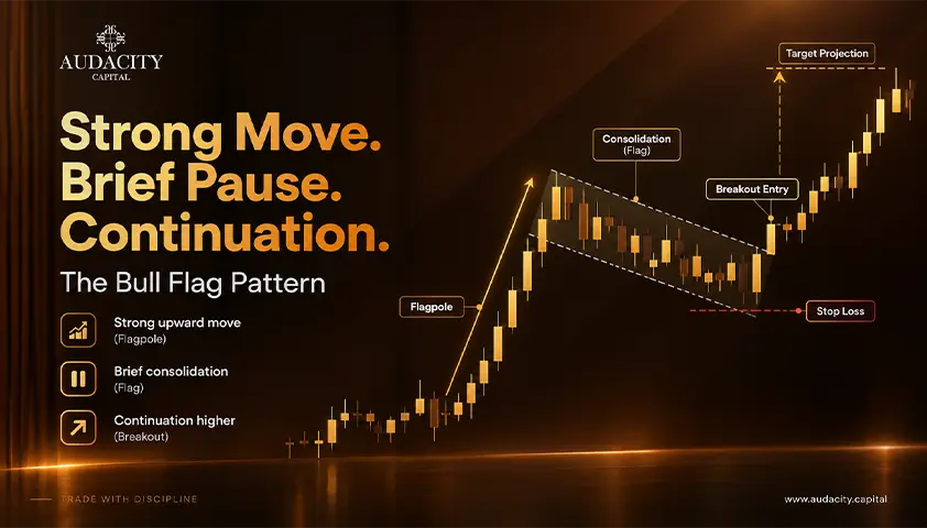
Bull Flag Pattern: A Comprehensive Guide
How the bull flag pattern works, how to set the entry, stop and target, and what the research actually says about its reliability.


Spinning Top Candlestick Pattern: Meaning, Formation & How to Trade
Learn what the spinning top candlestick pattern means, how it forms, bullish and bearish setups, confirmation signals, trading strategies, examples, and risks.

Prop Firms With No Minimum Trading Days
Prop firms with no minimum trading days compared, with evaluation rules, payout conditions and who each one suits.

Prop Firms That Allow Weekend Holding in 2026 (Compare Firms)
Compare prop firms that allow weekend holding. Explore weekend and overnight rules, news trading, drawdown, markets, profit splits and key restrictions.