

Footprint Charts Explained: How Order Flow Traders Use Them


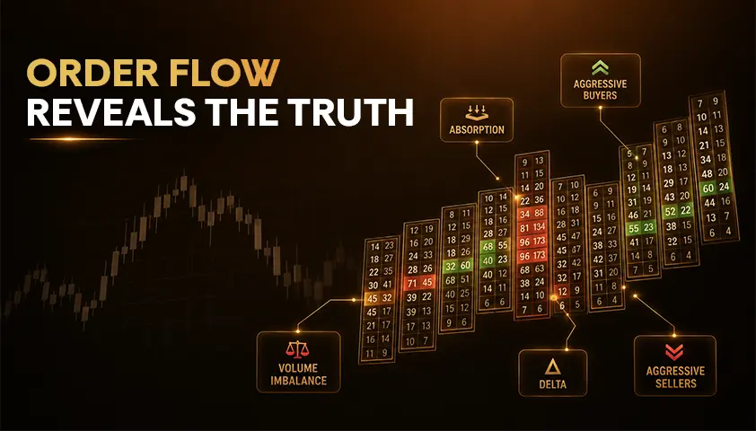
Footprint charts show how much buying and selling volume executed at individual price levels inside a single bar.
Where a candlestick summarizes open, high, low and close, a footprint opens the bar up and displays the traded volume printed at each price the market touched.
That extra detail has one practical purpose for order flow traders: it helps them judge whether buyers or sellers were acting aggressively, and more importantly, whether that aggression actually moved price.
Reading footprint charts well is less about spotting colored numbers and more about comparing intent with response at meaningful market locations.
So let’s get started.
What Are Footprint Charts?
A footprint chart is a price bar broken into individual price levels, with executed trade volume displayed inside the bar. You will see the same tool referred to as a cluster chart, numbers bars or volumetric bars, depending on the platform.
Compared with a candlestick, the difference is straightforward.
A candle tells you where price opened, traded and closed. A footprint adds where volume executed inside that range and which side, buyers or sellers, initiated more of those trades.
One limitation matters from the start: a footprint records executed transactions. It is not the same as the live order book, and it does not show every resting limit order that never got matched.
The depth of the market shows resting liquidity in real time. The footprint shows what was actually filled.
Anatomy of a Footprint Chart: Bid, Ask, Delta and POC
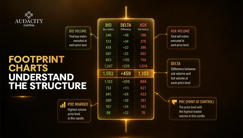
Before looking at patterns, decode a single cell. Most footprint layouts display two numbers per price level: bid volume and ask volume.
Bid volume represents trades executed at the bid, which is typically aggressive selling because a market sell order was matched against a resting buy.
Ask volume represents trades executed at the ask, typically aggressive buying because a market buy lifted a resting offer.
Together, this bid ask volume is the raw material behind everything else.
Delta is ask volume minus bid volume at that level, or aggregated across the entire bar.
Positive volume delta means more buyer-initiated activity.
Negative delta means more seller-initiated activity. Delta measures aggression, not future direction.
Total volume is the sum of buy volume and sell volume at a price.
The bar POC is the price level inside that bar that traded the highest volume. This is different from the session point of control shown on a full volume profile, which spans a much larger window.
How Footprint Charts Show Buyers and Sellers?
The most common beginner mistake in footprint chart trading is equating more buying with price going up and more selling with price going down. That is not how executed order flow works.
Aggressive buyers lift available offers. Aggressive sellers hit available bids. A footprint lets you compare that aggression price by price, but the useful signal comes from what happened next.
If aggressive buying appears and price continues higher, the order flow supports the move. If aggressive buying is heavy but price cannot rise, that failure to move may point to passive sellers absorbing the demand.
The same logic applies in reverse. Strong negative delta that pushes price lower confirms active selling. Heavy selling that cannot break support can be more meaningful than the negative delta itself.
Be careful with the passive side. Footprints make aggressive executions visible.
The passive liquidity on the other side is inferred from the fact that those market orders were matched, not directly identified from the chart.
Anchor every read to a location: prior high or low, a session support or resistance, VWAP, or a volume profile level. Scanning random bars for colored numbers is not order flow trading.
How to Read Imbalances and Stacked Imbalances?
An imbalance is a large difference between buying and selling volume around a price level, usually measured diagonally between the ask on one row and the bid on the next.
Platforms may compare volumes horizontally or diagonally and let you configure the percentage ratio that triggers the flag.
A stacked imbalance is several adjacent price levels showing the same side of dominance. Traders may treat a stacked imbalance as stronger evidence of initiative activity than an isolated cell, but the read still depends on where it prints.
A stack of buy-side imbalances into a well-defined resistance is different from a stack in the middle of a range.
Do not treat 3:1 or any other ratio as a universal rule. Present ratios as configurable examples, and if you are testing a strategy, keep the same settings across your data set so the signals stay comparable.
Absorption, Exhaustion and Delta Divergence Explained
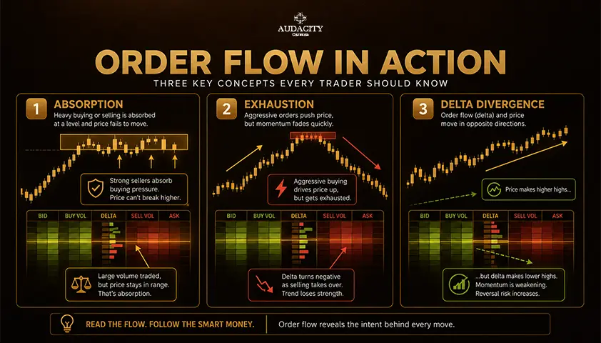
Absorption is the interaction between aggressive orders and a level that refuses to move.
Heavy buying that cannot lift price through resistance can suggest sell-side absorption. Heavy selling that cannot push through support can suggest buy-side absorption.
What you see: strong aggression on one side.
What it may mean: passive counter-orders are being filled at that level.
What invalidates it: price finally breaks through with continued aggression.
Exhaustion describes aggressive participation drying up near an extreme, often after a strong impulsive move.
What you see: shrinking volume and thinning imbalances at the edge of a range.
What it may mean: the dominant side is running out of initiative.
What invalidates it: fresh aggression re-enters and continues the move.
Delta divergence compares price movement with delta movement. Price makes a new high while delta does not, or price makes a new low while delta improves.
What you see: a mismatch between direction and aggression.
What it may mean: the current move lacks initiative support.
What invalidates it: price continues in the direction of the high or low regardless of the delta signal.
None of these are automatic reversal triggers. They are context clues that need a defined level and a defined price trigger to become part of a trade plan.
How Order Flow Traders Read Footprint Charts Step by Step
Here is a fixed workflow for reading footprint charts rather than a scattered checklist of signals.
Note: This is the practical answer to how to read footprint charts in real trading conditions.
Step 1. Mark the market location first.
Prior day high or low, session VWAP, a volume profile POC, a range boundary, a swing level. No location, no read.
Step 2. Inspect where volume concentrated.
Where did the bar POC print inside the bar? At the highs, at the lows, or in the middle? Volume at price is your first structural clue.
Step 3. Compare bid and ask aggression with what price actually did.
Positive delta with follow-through is different from positive delta that stalled at the same tick.
Step 4. Look for repeatable patterns.
Stacked imbalance, absorption, exhaustion, delta divergence. Name what you see before you act on it.
Step 5. Define the trigger and invalidation from price structure.
The entry comes from a break, a rejection or a failed test, not from the color of one footprint cell. The stop sits beyond a structural point that would prove the read wrong.
A footprint is a confirmation layer. If you cannot explain the setup from price structure first, more order flow detail usually creates noise rather than clarity.
3 Practical Ways Traders Use Footprint Charts
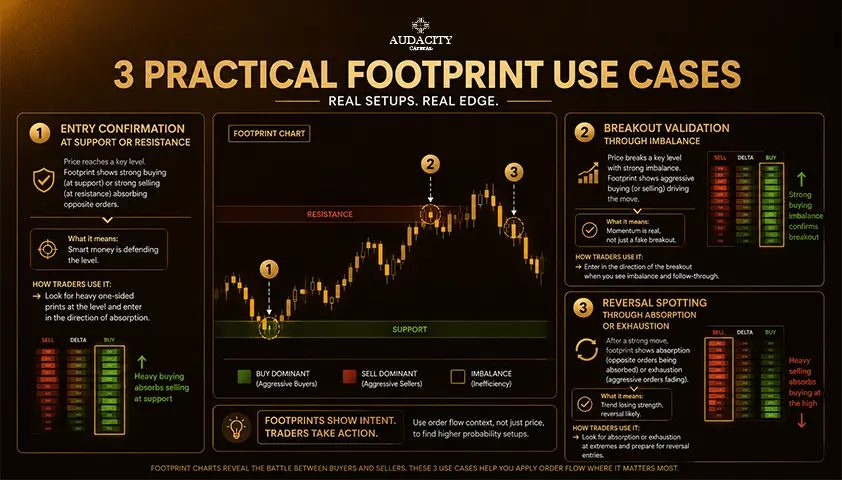
1. Breakout confirmation.
Price reaches a defined resistance. The trader looks for aggressive buying, stacked ask imbalances and continued progress through the level.
Context: prior day high.
Footprint evidence: stacked buy imbalances printing at and above the level.
Entry trigger: acceptance above the level with continued positive delta.
Invalidation: price fails to hold above the level and reclaims the range.
Skip it: strong positive delta but no price progress through the tick, which suggests supply is absorbing the push.
2. Reversal after absorption.
Price tests support heavy aggressive selling but stops progressing.
Context: session low and a higher-timeframe support.
Footprint evidence: heavy bid volume printed at the low, negative delta, no new lows.
Entry trigger: a defined failed-break or rejection pattern in price.
Invalidation: a clean break of the tested level.
Skip it: no reversal trigger in price, just an interesting bar. Absorption alone is not an entry.
3. Pullback continuation.
In an established uptrend, price retraces into a planned demand area.
Context: pullback into a prior breakout level or VWAP.
Footprint evidence: countertrend selling fading, negative delta shrinking, no new lows.
Entry trigger: reclaim of a short-term structure level.
Invalidation: continuation lower through the demand area with fresh sell-side aggression.
Skip it: countertrend aggression accelerating rather than fading.
Outcomes are hypothetical. A single screenshot of any pattern working is not proof of an edge, and every one of these setups can fail.
Footprint Charts vs Candlesticks, Volume Profile, DOM and Cumulative Delta
Different tools answer different questions. There is no single best chart.
Tool | What it answers |
Candlestick | Where did the price open, trade and close over the bar? |
Footprint | How much volume executed at each price inside the bar, and which side was aggressive? |
Volume Profile | Where did volume accumulate across a larger session or period? |
Depth of Market (DOM) | What resting orders are visible in the book right now? |
Cumulative Delta | What is the net aggressive flow across multiple bars? |
A practical workflow is price structure first, footprint for execution detail inside the bar, then volume profile for higher-timeframe context, DOM for live liquidity, and cumulative delta when you want to see aggression as a running total.
Add tools when they answer a specific question. Stacking every order flow view on one screen usually reduces clarity.
Which Markets Are Footprint Charts Most Useful In?
Futures are the cleanest teaching example for order flow trading because exchange-traded contracts have centralized transaction data.
With a proper tick data feed, bid and ask classification is consistent, and volume figures reflect actual trades on that exchange.
Crypto footprints are exchange-specific. A footprint from one venue represents trading on that venue, not the whole crypto market.
When liquidity is split across many exchanges, a single-venue footprint can look decisive while the broader market tells a different story.
Equities trade across multiple venues, so the completeness of an equity footprint depends on the consolidated data feed behind the chart.
Spot FX is decentralized, which makes exchange-style volume footprints less straightforward than futures. Some traders use FX futures instead for a cleaner order flow read.
The practical requirement is the same everywhere: footprints need granular trade data and accurate bid or ask classification.
A clean-looking chart built on incomplete or synthetic data can create false confidence rather than useful information.
Common Footprint Chart Trading Mistakes
Mistake 1: Trading every imbalance as if it were an entry signal. Imbalances are context, not triggers.
Mistake 2: Reading delta without checking whether the price actually responded. Aggression that does not move price often matters more than aggression that does.
Mistake 3: Looking for absorption, exhaustion or divergence in the middle of nowhere instead of at planned levels.
Mistake 4: Treating a configurable imbalance threshold, color scheme or bar type as a universal market rule. These are settings, not laws.
Mistake 5: Assuming the footprint identifies institutions or reveals hidden intent. It shows executed activity. Interpretation is still on you.
Mistake 6: Ignoring data quality, transaction costs and risk management because the chart looks more precise than a candlestick.
Precision in the picture is not the same as precision in the outcome.
Conclusion
Footprint chart trading is a reading process, not a signal generator.
Start with market location, read executed volume and aggression, compare that aggression with the price response, then use recurring patterns as confirmation for a predefined setup with a defined invalidation.
More detail is not automatically more edge. Footprints give you more resolution than candlesticks, but the value depends on a consistent process, reliable data and tested risk rules.
Traders working through evaluation programs or trading firm capital face the same reality: the discipline that turns information into results sits outside the chart.
Ready to Put Your Trading Skills to the Test?
Apply your footprint chart knowledge in our Free Monthly Trading Competition. Top-performing traders can win a Free Funded Account Challenge, giving them the opportunity to prove their consistency and progress toward managing firm capital.
Frequently Asked Questions
A candlestick shows the open, high, low and close of a bar, while a footprint chart also shows how much volume traded at each price level inside that bar. The footprint adds bid versus ask aggression and delta, giving execution detail that a candle does not provide. Both use the same price data underneath.
Bid volume is the amount traded at the bid price, typically aggressive selling, and ask volume is the amount traded at the ask, typically aggressive buying. These figures separate initiated activity from passive fills at each price level. Reading them side by side is how order flow traders assess who was pressing at that tick.
Delta is ask volume minus bid volume, either for a single price level or for the whole bar. Positive delta means buyer-initiated volume dominated, and negative delta means seller-initiated volume dominated. Delta measures aggression, not direction, and needs to be compared with what price actually did.
A stacked imbalance is several adjacent price levels where one side, buying or selling, dominates by a configured ratio. Traders may treat stacks as stronger evidence of initiative than a single imbalance, but the meaning depends on location and price response. A stack at a defined level is more meaningful than one printed in the middle of a range.
Absorption typically shows as heavy aggressive volume on one side without corresponding price progress. Buying that cannot push through resistance despite large positive delta may indicate sell-side absorption at that level. Confirmation requires a price reaction, and continued follow-through in the direction of the aggression invalidates the read.
Yes, but data quality varies significantly. Futures give the cleanest read because transactions are centralized on the exchange. Crypto footprints are venue-specific, equity footprints depend on the consolidated feed, and spot FX is decentralized enough that exchange-style volume footprints are less reliable than in futures.
No. A footprint shows executed transactions and which side was aggressive, not the identity or size class of the participants behind them. Large prints can come from any type of trader, and small prints do not exclude professional activity. The chart shows behavior, not identity.

هل أنت مستعد لتطبيق مخاطر منضبطة على العملات المشفرة؟ استكشف أدوات التشفير الجديدة من Audacity Capital واجلب استراتيجية التداول الخاصة بك.
اعرف المزيدالنشرة الإخبارية
انضم إلى نشرتنا الإخبارية.
انضم إلى مجتمعنا الاجتماعي

ابدأ رحلتك اليوم مع تجربتنا المجانية
اعرض مهاراتك وإنجازاتك بفخر من خلال الشهادات واحصل على تقدير لعملك الجاد وتفانيك من المستثمرين المحتملين والأقران.
تجربة مجانيةمقالات ذات صلة

Order Flow Imbalance: How to Read Buy and Sell Pressure
Learn what order flow imbalance means, how footprint and order book readings differ, and how traders assess buy and sell pressure with context.

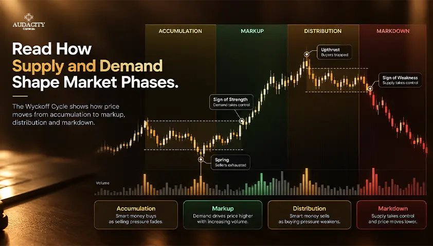
Wyckoff Method Explained: Phases, Rules and Examples
Learn the Wyckoff Method, its three laws, accumulation and distribution phases, trade examples, and the limits of price and volume analysis.
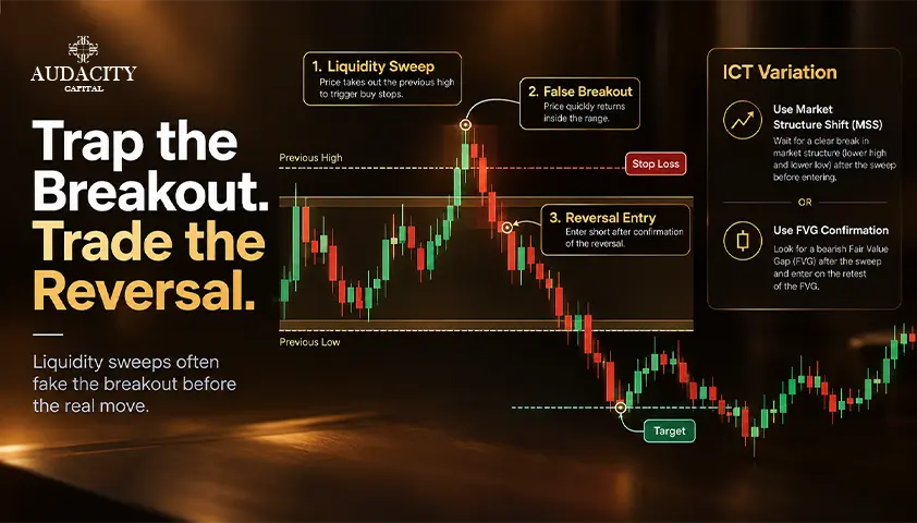
Turtle Soup Trading: Rules, Examples and ICT Variations
Learn turtle soup trading with original rules, ICT variations, bullish and bearish examples, risk controls, and a practical backtesting checklist.
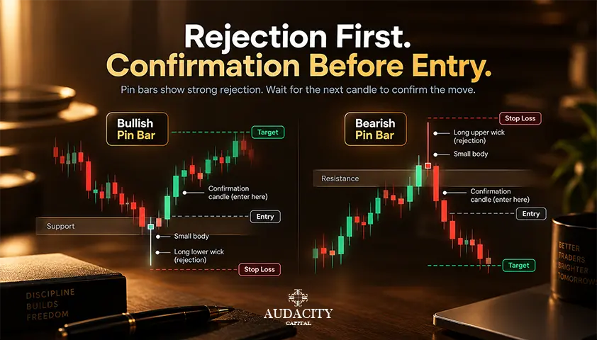
Pin Bar Candlestick: How to Identify and Trade It
What a pin bar candlestick is, how it differs from a hammer, the two entry methods compared, and why location does most of the work.